• FR
  • EN
Agence Pierre Katz
  • Projects
    • By industry
      • Wines & Spirits
      • Fashion & Beauty
      • Culture & Media
      • Hotels & Gastronomy
      • Jewellery
    • By expertise
      • Brand Identity
      • Packaging
      • 3D design
      • Graphic charter
      • Typography
    • By brand
      • Ruinart
      • Hermès Parfums
      • Alaïa Parfums
      • Remy Martin
      • Moët & Chandon
      • Dom Perignon
      • Sofitel
    • Before/After
  • About
    • Our expertise
    • Our approach
    • Our team
  • Contact
  • Blog

MBWS

Logo design. Drawing and typography.

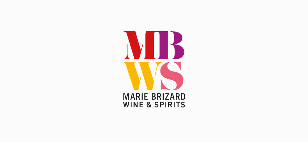
As Belvedere group changed its name to MBWS (Marie Brizard Wine & Spirits), we created a new logo which was imagined as a mark on a wooden case.


The color of each MBWS initial echoes one of the four pillars of the group: red for Sobieski vodka, purple for Marie Brizard liqueurs, yellow for William Peel whisky and pink for Fruits and Wine.


The black baseline creates a sense of stability and symbolises the historic roots of the company. Stability and trust are the guiding values of the Marie Brizard Wine & Spirits group. The overall effect is festive, bold and full of flavor while retaining a sense of rigor.


All projects « MBWS » Tous les projets
Photo copyright reserved. © Agence Pierre Katz
Download our portfolio